As SpaceX prepares to launch NASA’s Crew-1 mission to the International Space Station, the Crew Dragon spacecraft has already distinguished itself from prior generations of space capsules.
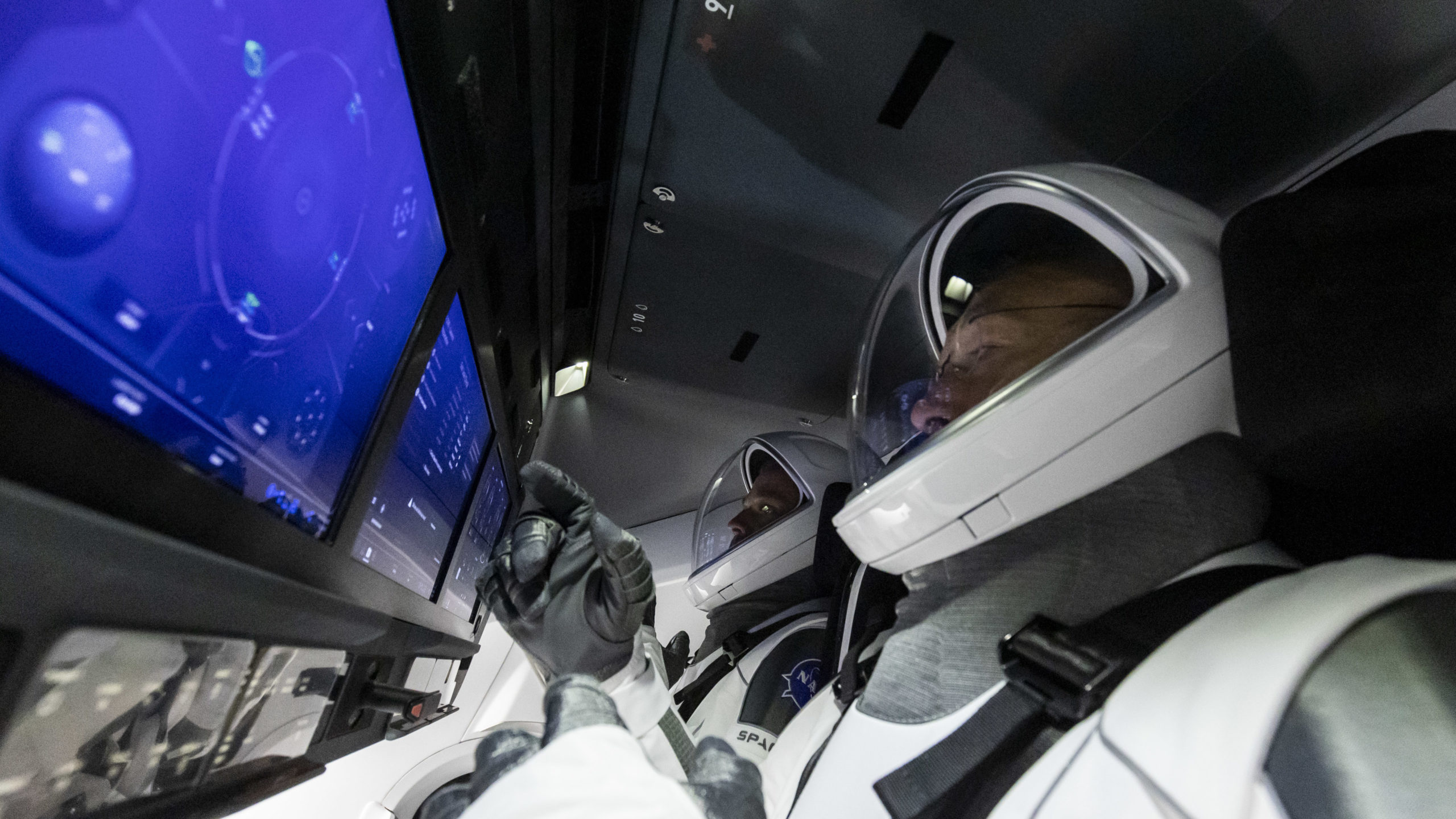
Bob Behnken and Doug Hurley set off from NASA’s Kennedy Space Center on May 30, 2020, and reached the ISS with no complications while testing out new features designed by the SpaceX team. Onboard were groundbreaking new tools such as the spacecraft’s dashboard. Normally when you see a picture of a cockpit, levers, dials, and gauges fill all the surfaces. Aboard the Dragon though, is a sleek touchscreen and a handful of buttons.
Questioned over their use of a touchscreen for a mission-critical interface, the SpaceX software team took to a Reddit AMA to answer questions.
According to the team, their goal was to follow a human-centered design. This included safety and “identifying minimum crew interaction as a success criteria.” According to Sofian Hnaide, a SpaceX team member, they mapped out the crew’s tasks. They identified critical functions and then broke it down into a digestible screen display.
Human-Centered Design and Chromium
What is “human-centered design” and why is SpaceX prioritizing it?
Human-centered design, in short, is the idea that people will follow a routine that is intuitive. By increasing accessibility, a task will be easier to accomplish. This can improve safety, efficiency, and happiness among users.
For example, a person is working in an assembly line and they need to cut a piece of wood. They need to perform this action dozens of times an hour, but they have to travel to get the tools each time. By moving the tools closer productivity improves. Small, simple changes in layout can drastically improve performance and safety.
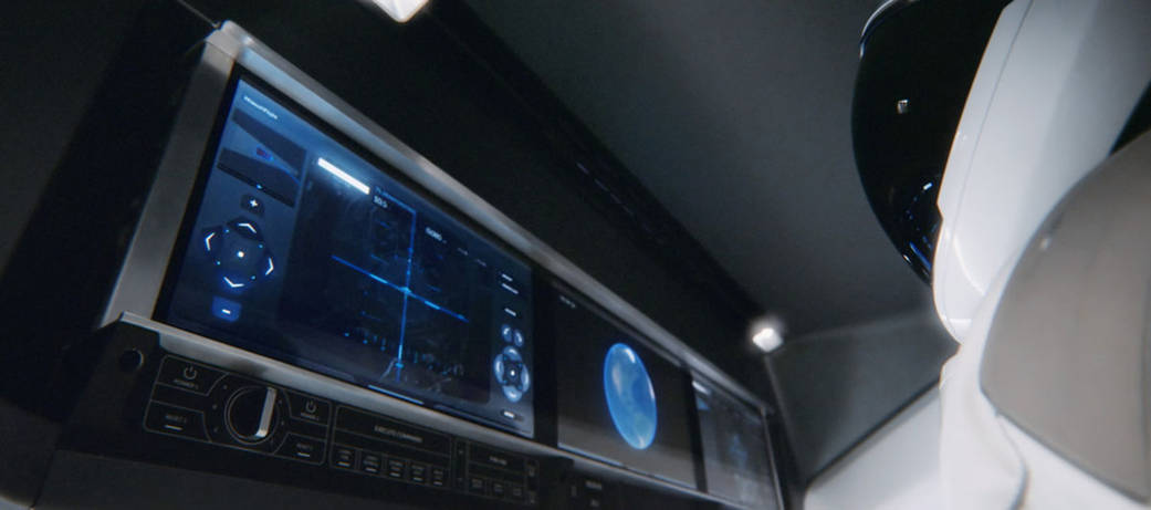
With this in mind, the SpaceX software team sat down with Behnken and Hurley to develop the dashboard. Together, they identified all the commands for typical and emergency protocols.
Then, they identified which data would be mission-relevant and made it part of the main display. Emergency hardware buttons were designed to function in case the display was rendered useless.
Some of these include:
- Break out button to abort a station approach
- Emergency deorbit
- Execute command
- Cancel command
- Cabin fire response
The Dragon software team used Chromium to develop their dashboard’s user interface (UI). Chromium is a free and lightweight browser framework. Google uses it as the core for its Chrome browser – which arguably dominates the browser world today. The same code used by people to look up sleeping pug videos helped astronauts reach the International Space Station.
Per the Reddit AMA, Sofian Hnaide explained Chromium was originally part of a proof of concept to NASA. They hadn’t intended to use it in real-world applications. As testing continued they found the stack to be robust and reliable, so they moved forward with the design. Chromium gave the dashboard modern features and gave the team access to a fluent talent pool.
Chromium is only surface level though. The dashboard and user interface look straight out of Star Trek, but in reality, it hands off commands to a Linux and microcontroller backend. According to SpaceX, they used a combination of CSS/HTML/Javascript for the displays, C++ for vehicle controls, and Python for testing.
- Linux – an open-source (aka free) operating system that can be highly customizable
- Microcontroller – a tiny specialized computer that’s usually designed to handle a single task (push a lever, release a solenoid valve, etc.)
Autonomous and Manual Flight
So the controls look space-age, but how well do they actually work?
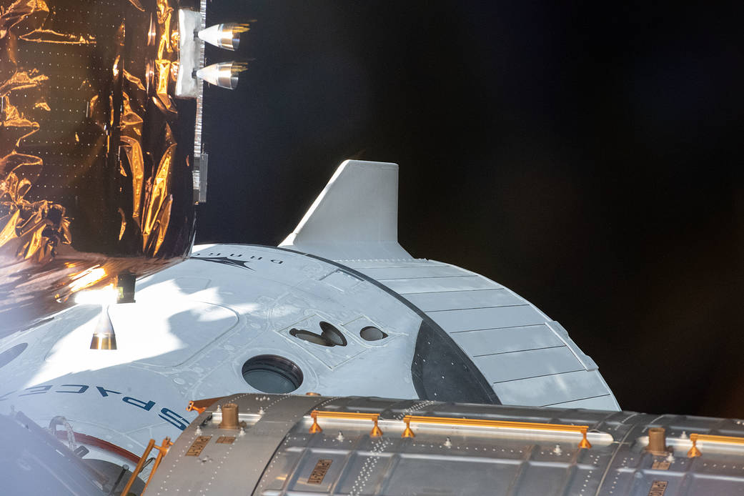
The ship is designed to be completely autonomous – including docking, landing, and de-orbiting but it does have the option for manual flight. Before the ISS docking process, Behnken and Hurley took the Dragon for two manual flights. Hurley ran through a series of commands to test out the controls.
In a TechCrunch interview, Hurley noted, “The difference is you’ve got to be very deliberate when you’re putting in input, relative to what you would do with a stick,” he continued. “Because you know, when you’re flying an airplane for example, if I push the stick forward it’s going to go down. I actually have to make a concerted effort to do that with the touchscreen, if that makes sense.” He followed on to say that for the docking process “the touchscreen is gonna provide us that capability just fine.” For future space tourism, this touchscreen will probably become the new normal.
If you’re interested in trying it out SpaceX made a simulator for the Dragon docking process. The key is patience and remaining calm as you approach the station. The controls are relatively simple and intuitive. Enjoy!

